I have a lot of characters, for my stories, from roleplays and games, and just generally coming up with OCs that may one day see a story. Often I don't have any visual reference for them, other times I find close enough art or mess around with generators. But sometimes, in a blue moon, I try and draw them. Here's a couple of those that I think are good enough to have on-hand to share. So far, these were all done on paper, with pencils, colored pencils, and a little bit of marker. I don't have a scanner, so they're photographs, though I've tried to pick ones with good lighting. It might be a while before I do any more, or the mood might strike me again soon. It's also possible I could do character art with digital illustration if I decide to put the time in to practice that enough to draw anything for real.
Also, the images are shrunk a little for tidier display, so you can view them in fuller size if you save or open the image in a new tab. With that said, the images:

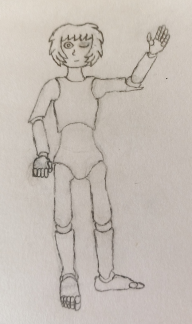
"Dollbot" — I think these are the best hands and feet I've ever drawn. It's not saying much, but I'll still be proud, even if the left hand is jank. I like how the joints in general turned out, really. Said joints are largely inspired by those little poseable artist's mannequin dolls, and the character herself is supposed to be almost like a porcelain doll in her aesthetics, rather than realistic. Also, this character has a name, but as she'll appear in something on Preternaturality eventually (pinky swear) I'm going to be cagey with that for now.

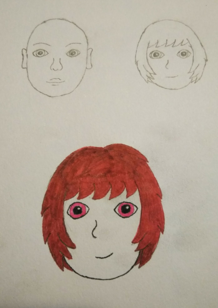
And here's an illustration of her face! I'm still pretty happy with that hair. The main thing about this image is that it's supposed to depict a face that is highly stylized and simplified. But the way I draw faces is already stylized and simplistic. The solution? Draw a more detailed, less stylized face, to give context to the face I draw the same way as any other face. Truly, I am an artistic genius. More seriously I do think this works reasonably well to communicate the idea, though I'm naturally biased to understanding myself. And looking at it now I can't help but notice how the colored version is a little lacking in some of the distinctive stylized features compared to the pencil one (especially the more extreme roundedness), but oh well.

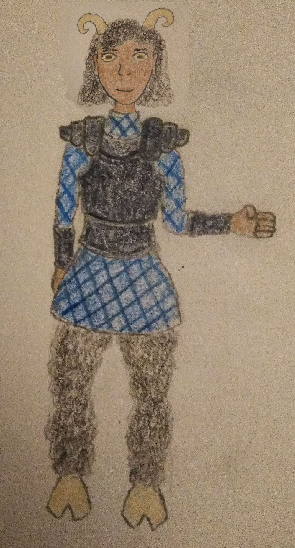
Naomi — This is a D&D character from an online game I was in with friends. Naomi Elle is such a sheepy creature on account of being Woolese, one of the sheeple from Woolan. I tried to depict something actually reasonably like cuir bouilli instead of the usual D&D fare (if you want leather to work as armor, it has to be stiff, basically) although the realism factor might be undercut a bit by the fact that, Woolan being a vegan society, it was actually pleather armor. Nobody else seemed to think that was as funny an idea as I did. Silly subject matter aside, I'm still quite happy with that picture. And, as you may have noticed from the fact of how blatant it is, this has been edited. I drew a head on the body but it did not survive the coloring very well at all. I took a separate picture of the head, drawn bigger, edited it on, and eventually gave up on fixing the background. It also left the neck looking a little wonky, but I still feel like it looks a lot better this way. (I could probably do the edit better if I did it now, but eh.)

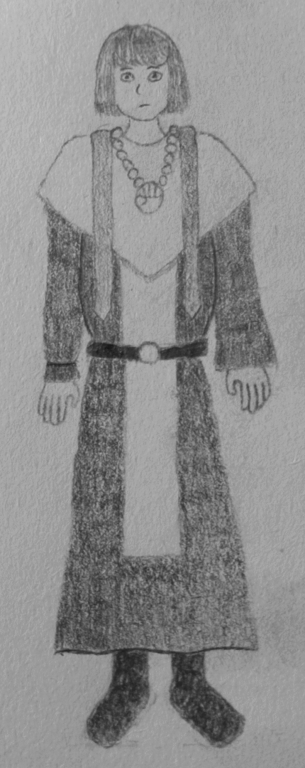
Rosamund — Rosamund Eolind is my character in the online D&D game I am currently, as of typing, playing in. I like her a lot, actually. Unfortunately, I can't quite say the same for my attempt at drawing her. I'm not that great at proportions and so can't quite diagnose what's gone wrong, but I'm pretty sure something has. Which isn't much of a surprise; see: I'm not that great at proportions. Maybe I can just blame it on the fact she's wearing underclothes, textile padding armor, chainmail, and then layered priestly vestments over that. It's probably only by the grace of her patron deity that she hasn't suffered heat stroke yet.
And that's it! At least for now.